I like the thought of presenting my photographs in my very own book. It it a highly effective way to get someones attention, I have to think carefully in terms of layout, colour, size and lots of other things to ensure I grab the viewers attention so that they take an interest in my book.
I have decided to choose 'A Journey' as my proposal, as I feel that the images I have taken fit perfect under this title, I have taken photographs whilst been out and about, mainly from cars - Highlighting and capturing many different journeys in different places.
Thursday, 13 March 2014

Thursday, 20 February 2014
Girls, some Boys and other Cookies


'Growing up is tough, even more so if you are a girl. You not only have to come to terms with you changing body, the incipient boyfriend problem, and the increasing pressures of reality: in order to become a woman you have to negotiate with socially prescribed gender roles, mass media's choice of role models and cliches, your parents' and peer group's expectations. German photographer Ute Behrend looks at the dilemmas facing young women with sharp wit and an exuberant confidence in woman's ability to playfully deal with society's gender images. Instead of presenting us with arid theories about gender and its discontents she created a picture book that is as funny and rebellious as it is critical.' - From the Publisher
This book has given me inspiration towards my book project, mainly because of the layout and the position Ute Behrend has decided to use. For example look at the two images above, I really like how the two photos fit together, in terms of colours and nature. Although the images are completely different they seem to fit together, similarly to all of her other images in the book- This is my intention for my own book.
Wednesday, 29 January 2014
Friday, 17 January 2014
PERSONAL PROJECT EVALUATION
For my independent learning agreement I decided to use the theme 'Family'. After a lot experimentation and research I finally ended up with portraits I really wanted! Using the Hasselblad camera has made me realise it's my favourite camera to work with, I feel so comfortable using it now after a lot of experimenting. Comparing my first photo shoot were the photos are really dark and dingy, I had to make a lot of changes. Firstly I decided to take the photographs outside, as I felt the natural lighting really enhanced the subjects in each photograph, next I used a natural background which made the subjects the focal point in each shot. Finally I used a tripod to ensure that the images were in sharp focus which is vital.
Printing has been really good for me this year, I feel I have progressed a lot in terms of taking my time to ensure the end process is how I want it to be and also by pushing myself for perfection rather than satisfactory.
I feel I have fulfilled all of my learning outcomes slowly with a few hiccups along the way, although my mistakes have got me to were I am now which makes me happy. My first learning outcome was to communicate effectively using a range of formats which I have completed by using the Hasselblad camera, processing and finally printing. I have also gained a lot more confidence working with close relatives and working with a film camera has helped me become independent in terms of working alone and focusing on a subject that I have chosen myself.


I took this image of my Aunty Ali at her own home also, I love her facial expression, again creating a really positive atmosphere. The central composition makes the viewer concentrate on the subject rather than anything else- which is exactly what I wanted to portray.


I was so happy with this print because It was exactly the image I had in my head for the outcome, also previously on my blog if you compare this photograph to my previous image of my dad you can see the progress I have made using the Hasselblad camera.

Overall I am so pleased with the outcome of these images from my final personal project, not just because it has enabled me to be more confident and independent but also because I love my family and I was happy to know how pleased they were with my final images. I feel easier talking to people and making them feeling at ease whilst taking a photograph - which I used to struggle with.. making the subject feel relaxed really shows in the photograph!
From this I now know how to control time management and plan my own project which is VITAL to my education and my future photography profession.
FILL-IN FLASH EVALUATION

So here is my final fill-in flash photograph! I took the photograph in Greatham Woods, Hartlepool of my friend Steph. I printed 20x24inch which was a "Light Jet" photographic digital print. After using the fill-in flash for the first time I fell in love, I love how the flash illuminates the background.. Its fascinating how much of a difference the fill-in flash has to a photograph without a flash.
I have decided on this particular photograph as my final photo, mainly because of her facial expression.. this creates a distant look as if she is deep in thought about something. It sort of reminds me of a film noir style (especially after I edited it black and white), I also love the natural lighting which you can see on the side of her face, this just adds extra contrast to the photograph as well as the fill-in flash.
I decided to edit the photograph black and white using photoshop because I feel the image became a lot stronger and also makes the viewer be less distracted by colour.
I love the trees in the background I think it creates a really mystical mood to the photograph, and helps to make the subject become the focal point of the shot.
I have decided on this particular photograph as my final photo, mainly because of her facial expression.. this creates a distant look as if she is deep in thought about something. It sort of reminds me of a film noir style (especially after I edited it black and white), I also love the natural lighting which you can see on the side of her face, this just adds extra contrast to the photograph as well as the fill-in flash.
I decided to edit the photograph black and white using photoshop because I feel the image became a lot stronger and also makes the viewer be less distracted by colour.
I love the trees in the background I think it creates a really mystical mood to the photograph, and helps to make the subject become the focal point of the shot.
Whilst using the fill-in flash I have developed confidence working outdoors and also with people, I have been able to demonstrate the ability to experiment with a range of equipment and manage my own work properly which has enabled me to become a lot more independent.
5X4 EVALUATION
Working with the 5x4 camera has certainly been the hardest part of the Portraiture brief, although I struggled at times I have thoroughly enjoyed it. When I first began shooting I found myself quite worried as we had to wait a few days to get our negs back, a few times when I had my negs returned the images did not come out, due to being exposed and under exposed. However, the more I worked with the camera the more comfortable I started to feel using it. Printing was also difficult at first as I had never experience using the colour dark room before, however once I got the hang of it and using the filters correctly it wasn't to bad.. printing 20x24 is the biggest I've ever printed and I was quite proud of myself. After printing and printing and printing, I started to get the colours neutral to how they looked in real life. Overall in this project I have developed my technical skills by using a large format camera, I also feel confident to use the camera in the future, and really enjoy printing colour.
Below is my final close-up, mid-length and full-length photographs..
Below is my final close-up, mid-length and full-length photographs..

This photograph was taken of my friend Steph, this is my close-up final shot. I love how her face is the main focus of the full image, with her neck and background blurred. The direct eye contact creates an intense serious mood to the viewer. I love the natural skin tones of her face and the closeness that enables the viewer to get up and close to her face.
I also intended for the background to be plain brick as I wanted to portray a subtle portrait.. This image reminds me of a album cover, I love her careless expression and the intense mood the photograph.
I also intended for the background to be plain brick as I wanted to portray a subtle portrait.. This image reminds me of a album cover, I love her careless expression and the intense mood the photograph.

This is my mid-length final photograph of another one of my friends, Lauryn. I love the models expression! It really creates a warm happy mood, also contrasting with her warm red hair colour. The plain brick background enhances the subject to stand out becoming the main focus of the photograph. I wanted the composition to be central, however, some space above the models head to create a plain background around her and also to create a mid-length shot.
I also am pleased with the way her hair is slightly blurred, this creates a sense of movement to the photograph. This is probably my favourite out of the three images.
I also am pleased with the way her hair is slightly blurred, this creates a sense of movement to the photograph. This is probably my favourite out of the three images.

This is my final full-length photograph of my uni friend, Reece. I am very happy with the outcome of this print.. although his face is out of focus, which could be a small concern.. although I felt it takes the distraction from his face and allows the viewers to look allover in the image rather than just his face.(Like the close-up shot of Steph). I took this shot at the Gare whilst visiting with university to take photographs (Apart from the rain it was a productive day). The green background and brick floor really contrast together really well, creating a bright mood which allows the viewer to be slightly distracted from the subject himself.
I love the central composition of the photograph and how the floor of the shot is 1/3 of the image, it really is an interesting portrait. His facial expression creates quite a serious mood, with his direct eye contact and the way he is stood.
Steve Pyke - Moonbug
http://www.youtube.com/watch?v=wqMuKFii3Hc
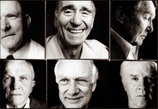
When we first got introduced to our final personal project we were shown a DVD named 'Moonbug'. Steve Pyke set out on a journey across America in his search to meet and photograph the Apollo space pioneers. The footage is very rare and interesting, its actually very inspiring to see the way Steve Pyke works with the Apollo space team and the way he seems to make it look so easy taking photographs on the Hasselblad. He has a very good way of speaking to people and making them feel extremely comfortable. The Dvd id both a photographic road trip and an exploration of how photographs become signposts for history.
The DVD made me feel a little uncomfortable as I was thinking about when I shoot the Hasselblad for myself and also how easy he made it seem whilst having a casual conversation with all of the Apollo Team. However, it gave me a little confidence to see how exciting the experience must have been.. also the outcome of his images are amazing and very defined.
Here are a few of his photographs below...
When we first got introduced to our final personal project we were shown a DVD named 'Moonbug'. Steve Pyke set out on a journey across America in his search to meet and photograph the Apollo space pioneers. The footage is very rare and interesting, its actually very inspiring to see the way Steve Pyke works with the Apollo space team and the way he seems to make it look so easy taking photographs on the Hasselblad. He has a very good way of speaking to people and making them feel extremely comfortable. The Dvd id both a photographic road trip and an exploration of how photographs become signposts for history.
The DVD made me feel a little uncomfortable as I was thinking about when I shoot the Hasselblad for myself and also how easy he made it seem whilst having a casual conversation with all of the Apollo Team. However, it gave me a little confidence to see how exciting the experience must have been.. also the outcome of his images are amazing and very defined.
Here are a few of his photographs below...
As you can see above the black backdrop Steve Pyke uses throughout photographing the Apollo team, really enhances their faces. Also it sort of reminds me of them being on the moon with the lighting he has used- I love this. The contrast of the images really make their facial features stand out and create quite dramatic shadows.
Subscribe to:
Posts (Atom)