Friday 21 November 2014

EVALUATION

For my minor brief we had to create our own practical assignment to be planned and structured by ourself. The area of Photography I decided to specialise in was Digital Portraits through the use of Colour. Through the past few months I have developed my knowledge and understanding of fine art photography by researching and spending a lot of time within a professional studio.
I have developed my technical skills by using photoshop and the new Phase 1 camera - although I decided to use the Hasselblad for my final images I explored using different cameras to finally realise I felt most comfortable using the Hasselblad.
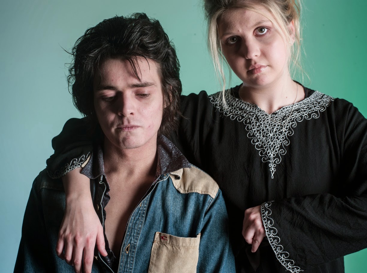
I began shooting in the studio being quite broad minded as I did not have what I wanted to do set in stone, However I knew that I wanted my images to be colour related.
The more time I spent in the studio the more I started to enjoy what I was doing, and therefore started feeling like I was accomplishing something I enjoy.
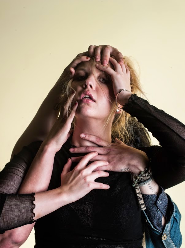
After I had been in the studio various times I felt pretty confused about the amount of photographs I had and struggled quite a lot to narrow them down to ones I felt were good enough to be potential final images.
I also come to realise its a lot better to have more photographs to choose from than less, As well getting my friends and teachers opinions and advice steered me into the right direction which enabled me to be deadly sure about what final photographs I wanted to select.
Having the opportunity to create our own brief has taught me that I need to be more organised, in terms of time management and planning.
Overall, I am pleased with my final photographs, however, If I was to re-do the full Minor brief I would have printed the images really large and maybe even selected a few less.

FINAL IMAGES


Preparation


I printed out all of my contact sheets in preparation to picking my final images.. I narrowed down my photographs by ticking the possible finals. My teachers also chose there favourite and marked them. After I picked the final possibles I cut them out which dramatically helped me as I was so confused with that amount of images in front of me. I placed them in order to see which images worked well together.. But then I started to think do they need to fit together??
As my brief was colour would it matter if the photographs subjects had a connection?? as they already have one (Colour). 
They also had a link to me personally as I think and feel in colour and the models used are close friends and family.

Shoot 7 Contacts


shoot 7

For my 7th shoot I decided to use more than one person.. It has sort of created what could be a story line.. I like how things are going in terms of making the shots a little less natural and more questionable as to whats going on to the viewer.
Again I have used my friends and family within the shots.
I feel the green and pinks create an atmosphere and setting for the viewer.. making not only the subjects but the background an important focal point.
I think I am going to use one of these as my final images as I think it will make the combination of portraits a lot more interesting- not only regarding colour.
The portraits using hands could create moods of anxiety, stress, suffocation or to be honest it could make the viewer have there own story in their head without knowing nothing about the photograph or the people in it.
My intention is for the viewer to create there own stories and opinions as different colours and compositions are different in everyones heads. No one will have the exact opinion of them.


Shoot 6 contacts


Shoot 6

For my 6th shoot i decided to use one of my good friends Max Bianco. I really think he has a distinct different style and thought he would work well within my photographs.
The more I was shooting the more I felt as if my images were starting to get a bit boring.. however I wanted to use him on one of my final images..
I looked through the images after the shoot and racked my brain to try and think what I could do to make the images a little less natural as I felt that the images could be getting quite boring to the viewer??
I think it was the colour blue i was getting bored of to be honest.
I felt like the colour didn't suit him as he wasn't a cold person..
I like the top image with the combination of purples and blues.
As I was looking through the images I thought to myself maybe I could include two people I know in my next shoot? maybe make things a little more interesting.
Anyway this is my first shoot I took of Max using the Hasselblad similarly to the other shoots.


Shoot 5 contacts


Shoot 5

For my fifth shoot I used my best friend Lauryn as my model. I think my shots are starting to have quite a fashion style to them with the clothes and contrasting colours.
I like where I'm going with the bottom image contrasting two different colours using lighting techniques.
I like how natural the shots are with the unnatural backgrounds I think they fit together quite well..


Shoot 4 contacts


Shoot 4

In my fourth shoot I felt really comfortable shooting as I had been in the studio various times. The model below is my older sister Sherilyn- who is quite comfortable in front of the camera. I feel like my photographs are starting to distinguish a style I like. I feel like I'm getting a pattern to my colour brief. 
I think the third pastel photograph is more natural in comparison to the rest which could be a potential final shot.. I think the light pink creates a soft tone which is also exaggerated by the natural expression.
I feel the hassleblad captures the colour rendition of my images really well.


Shoot 3


shoot 3

For my models I wanted to use people close to me like my family and friends as colour has connotations of feeling and atmospheres. I found it interesting to work with people who I already have connections with and felt comfortable working with. For my third shoot I took images of my younger sister Imogen. She felt really at ease in front of the camera as she is normally quite shy. I picked a pink outfit for her to wear as I wanted the images to be really bright. I felt the blue background really contrasted well with the pink clothes and her skin tones.
The colours compliment each other creating a cool mood working well the the natural facial expressions. 
I feel like I am starting to get somewhere regarding colour, one of these could be a potential final image.